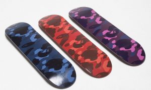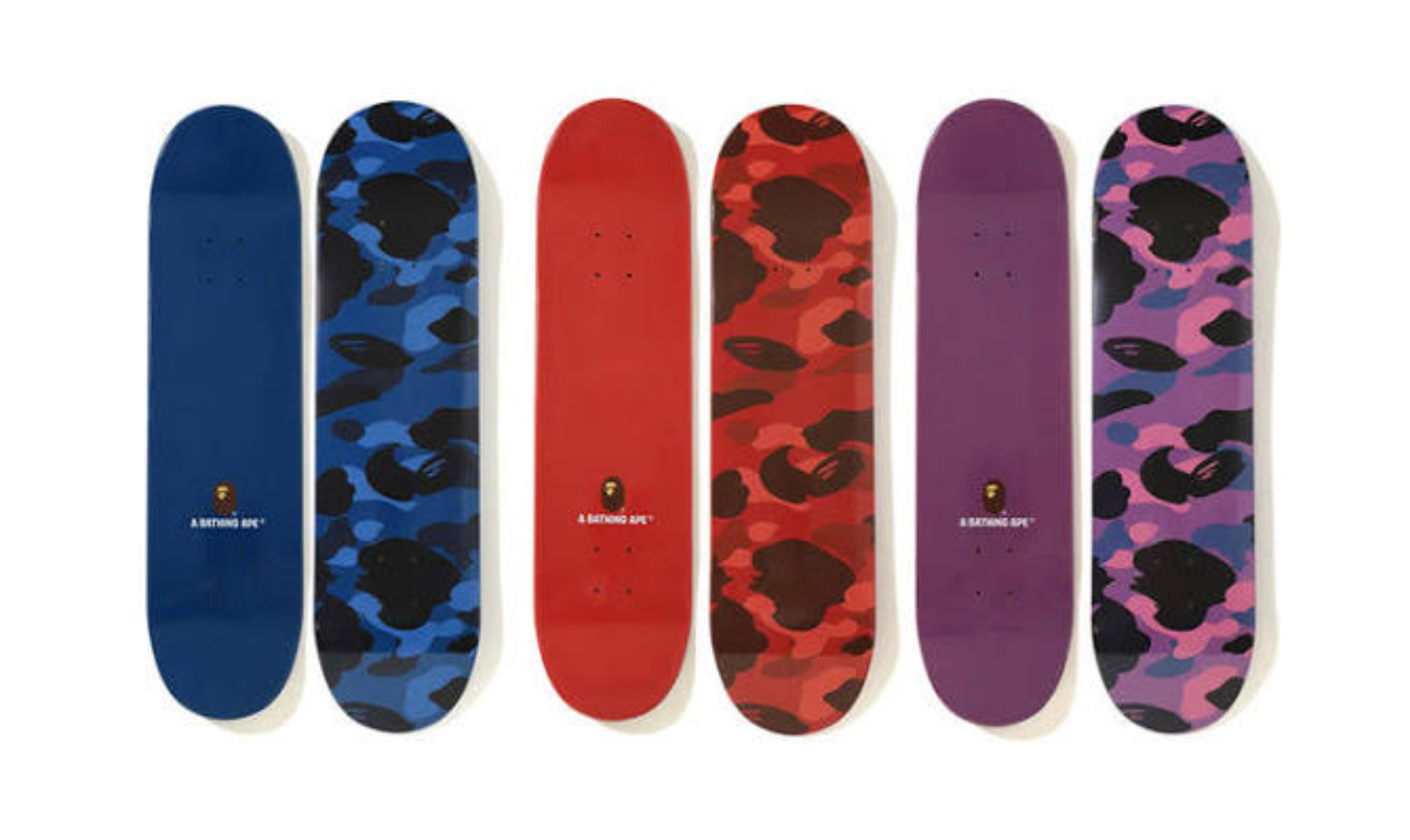
Hanging three camo decks together without a matching clash
You lay all three on the floor first. Red, blue, purple, each one a BAPE Color Camo deck from the FW19 season, every surface erupting with that signature all-over camouflage print rendered in a single dominant hue. They look extraordinary individually. Together on the floor, however, something feels off, a low-grade visual argument between three equally loud voices competing for the same square foot of attention. That tension does not disappear when you mount them on a wall. In fact, it gets worse, unless you understand exactly what you are doing.
Hanging three camo decks together without a matching clash is absolutely worth doing, but only with deliberate sequencing, correct spacing, and one well-chosen neutral anchor. Skip any of those three variables and you get a wall that reads as chaos rather than curation.
Why three same-brand camo decks fight for attention on one wall
First, understand the core problem. Camouflage is a pattern built on visual tension. It layers shapes of similar value to confuse the eye, which is the entire point militarily. BAPE’s Color Camo version amplifies that tension by flooding a single hue across the entire surface, from tip to tail.
Each Color Camo deck measures 8 x 31.25 inches (20 x 79 cm), screen printed on 7-ply Canadian maple hardwood. That is a tall, narrow vertical rectangle. Three of them together create a lot of visual surface area, and every inch of it is active pattern. However, the real fight is not between the decks themselves. The fight is between the decks and the wall behind them.
Pattern fatigue is real
Pattern fatigue happens when the eye cannot find a resting point. In a gallery of paintings, for example, the frame and neutral wall provide that rest. With three camouflage decks, you remove most of those neutral zones. As a result, the viewer’s gaze bounces continuously across the surface without landing anywhere satisfying.
Moreover, BAPE’s Color Camo uses a warm-cool palette even within a single colorway. The red deck carries warm orange undertones. The blue deck reads cool and slightly violet. Sitting in the middle, the purple deck pulls toward both. Placing them randomly means the warmest deck and the coolest deck end up fighting each other at every edge where they sit in proximity.

Explore the full collection
Figures, art toys & limited editions — shipped across Europe from France.
Sequencing red, blue and purple so the eye has a path
This is the most important decision in the entire display. Think of it like a music playlist: the order creates the emotional arc.
The correct sequence, left to right, is blue, purple, red. Place the BAPE Color Camo Skateboard Deck in Red at the far right and the BAPE Color Camo Skateboard Deck in Purple in the centre. Blue anchors the left edge.

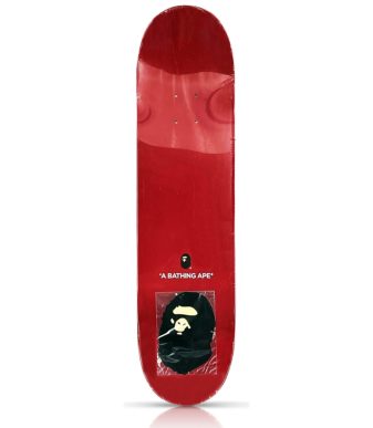
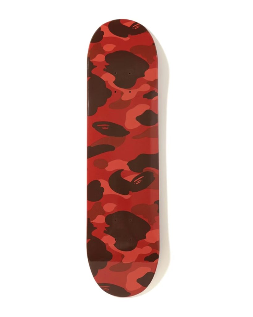
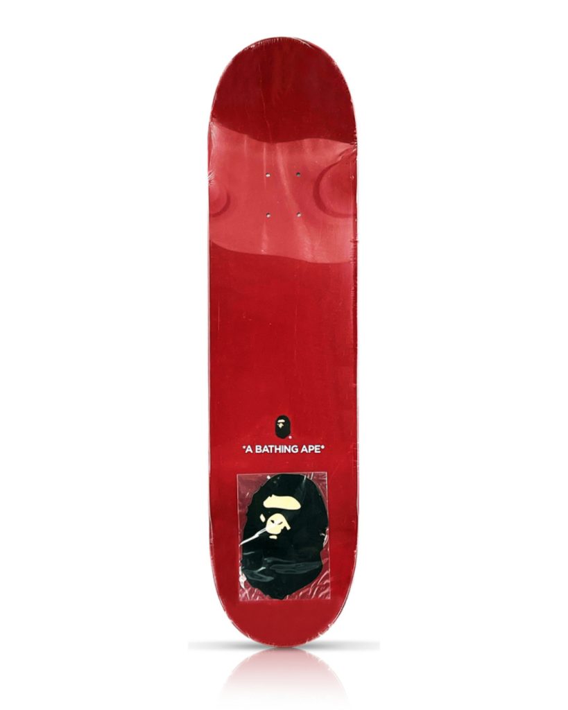
BAPE Color Camo Skateboard Deck (Red, FW19)
Rare BAPE Skateboard Deck Featuring the Iconic Red Color Camo
The BAPE Color Camo Skateboard Red (FW19) is a highly collectible piece from the Fall/Winter 2019 collection, combining the unmistakable aesthetic of BAPE with skate culture and streetwear design. Featuring the brand’s signature Red Color Camo pattern, this deck is a standout item for collectors and fans of Japanese streetwear.
Why this specific order works
The blue-purple-red sequence runs along the visible color spectrum from cool to warm. The eye reads this as a natural gradient, which the brain processes as intentional and resolved. Any other order, red-blue-purple or purple-red-blue, forces the eye to jump across temperature gaps mid-sequence, which reads as random.
Additionally, purple functions as a perfect bridge. It shares blue’s violet base on its left side and shares red’s warmth on its right side. Therefore, the centre deck mediates the conversation instead of interrupting it. The result is three distinct personalities that still feel like a family.
Wall colour matters just as much
Most importantly, the wall itself must stay neutral. A warm white or off-white gives the whole set room to breathe. A cool white slightly boosts the blue deck, and that is fine. Avoid grey walls with strong blue undertones, as they will flatten the blue deck to near-invisibility. Similarly, any warm terracotta or ochre wall will over-amplify the red deck and destroy the balance you worked to create.
Where a neutral illustrated deck earns its spot beside camo decks
Three camo decks in a row, however well-sequenced, still carry a risk: the display feels like a brand shrine rather than a curated collection. That is where a fourth deck, specifically one built on a natural wood background with bold illustrated linework, changes the entire reading of the wall.
Los Angeles artist Steven Harrington teamed up with HUF to produce a range of decks, with the Natural colourway measuring 8.25 x 32 inches (21 x 81 cm) and constructed from seven layers of hard rock maple. The deck features Harrington’s signature HUF “Skate Rat” character on a natural wood bottom with custom artwork.

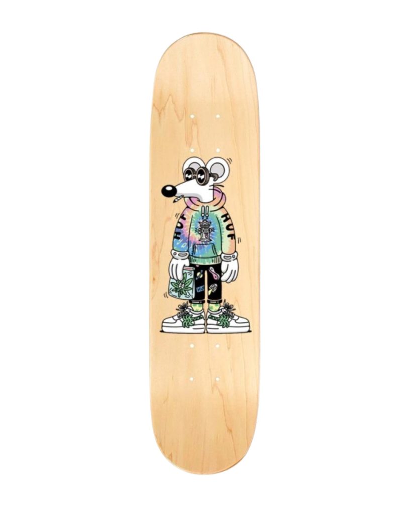
HUF x Steven Harrington Natural Skateboard Deck
The HUF x Steven Harrington Natural 8.25″ skateboard deck pairs a full-size maple deck with Harrington’s signature psychedelic artwork. Vivid colours and playful motifs cover the board from nose to tail.
The case for placing it on the far left
Position the HUF Steven Harrington Natural 8.25″ (21 cm) at the far left, one deliberate gap away from the blue BAPE deck. This placement does three things simultaneously. First, it introduces a neutral tone at the entry point of the display, so the eye has a genuine resting place before entering the colour sequence. Second, it signals that this is a curated wall rather than a uniform brand drop. Third, the natural maple wood grain reads warm without competing, since Harrington’s linework sits on top rather than flooding the surface the way camo does.
Steven Harrington is an LA-based artist and co-founder of design firm National Forest, cited as a leader of a contemporary Californian psychedelic-pop aesthetic best known for his bright, iconic style. Notably, that brightness comes from line and shape rather than from surface saturation. Contrasting with the BAPE camo decks in method rather than just in colour makes the contrast feel intelligent instead of arbitrary.
Spacing and hardware that keep the set looking curated
Correct sequencing fails completely with incorrect spacing. Here are the exact numbers that work.
| Gap Type | Recommended Distance | Why It Matters |
|---|---|---|
| Between each BAPE camo deck | 6-8 cm | Tight enough to read as a set, wide enough to show each deck’s edge |
| Between HUF deck and blue BAPE deck | 12-16 cm | The larger gap signals a deliberate editorial pause |
| Deck bottom clearance from floor or shelf | Minimum 40 cm | Prevents the display from reading as storage |
| Centre of deck array to eye level | 150-155 cm from floor | Standard gallery hang height for vertical works |
Hardware: invisible is correct
Use clear acrylic wall-mount deck brackets, not J-hooks. J-hooks scratch the underside of the graphic and create visible metal glinting in photos. Clear acrylic brackets grip the board at the nose and tail, keeping the entire graphic face visible from the front while the hardware disappears against the wall.
Furthermore, always mount into studs or use proper wall anchors rated for at least 5 kg per bracket. A deck falling from height damages the graphic beyond repair, and these FW19 BAPE decks no longer exist at retail. Use a laser level rather than a tape measure, because even a 2-degree tilt on one deck is visible against the straight horizontal of the others, and the human eye catches it immediately.
| Hardware Type | Verdict | Best For |
|---|---|---|
| Clear acrylic deck brackets | Recommended | Full graphic display, photography |
| J-hook metal hangers | Avoid | Functional riding setups only |
| Adhesive strips (Command-style) | Avoid for decks over €200 | Lightweight temporary use only |
| Floating shelf with lip | Acceptable | Rotating display that changes monthly |
Explore the full collection
Figures, art toys & limited editions — shipped across Europe from France.
When to break the set apart instead of forcing a match
Here is the honest side of this verdict: not every space suits four decks together. Sometimes the right call is to split the set.
Break the set if your wall is under 160 cm wide. Four decks with correct spacing require roughly 130-140 cm of horizontal run. Push that into 150 cm and the gaps compress, the HUF editorial pause disappears, and everything collapses into a single undifferentiated mass.
Consider breaking the set if your room already carries heavy pattern elsewhere: a large geometric rug, a heavily textured wallcovering, or patterned upholstery within sightline. In that context, even a well-sequenced three-deck camo display tips the room into visual overload. Instead, pull the red or blue BAPE deck as a standalone hero piece, mount it alone at true centre with 30 cm of clear wall on each side, and let the camo pattern fully breathe.
The solo display argument
In fact, a single BAPE Color Camo deck hung alone makes a stronger statement than three hung incorrectly. Released as a limited edition, the Color Camo deck sold out at retail and now carries a certificate of authenticity and an original BAPE sticker. That provenance matters, and letting one deck breathe solo honours that status. However, if you have the wall space and commit to the sequencing rules above, the three-deck set is the superior display without question.
Rare Inventory Recommendation
For the complete four-deck wall described in this guide, start with the BAPE Color Camo Skateboard Deck Red (FW19) and the BAPE Color Camo Skateboard Deck Purple (FW19), both available now at Rare Inventory at €300 each. For the neutral anchor, browse the full Rare Inventory collection for the HUF Steven Harrington Natural 8.25″ (21 cm) and complementary illustrated decks. Additionally, if you want a different kind of illustrated contrast piece, the Haroshi x Together Together Tiger Skateboard Deck (2021) or the Haroshi x Together Together Tiger Mask Shaped Deck (2021) both bring sculptural, neutral-toned contrast at €250 each, both from the same FW season sensibility.
Where to buy
Rare Inventory carries the BAPE Color Camo decks and a curated selection of collectible skateboard decks for serious display collectors. Based in France, Rare Inventory ships across Europe with secure packaging appropriate for wall-art-grade pieces. Therefore, browse the full range at rareinventory.com and build your set before these FW19 units are gone for good.

Frequently asked questions
Do I need to remove the trucks before hanging a skateboard deck as wall art?
Yes, always remove trucks for a display-grade wall mount. Trucks add weight, force the deck away from the wall at an awkward angle, and conceal the graphic edges. Store the original hardware in a labelled bag with the deck, since original hardware contributes to future collectible value.
Will sunlight damage the BAPE Color Camo screen print over time?
Direct UV sunlight fades screen-printed graphics on maple decks within months. As a result, position the display on a wall that receives no direct sunlight at any point in the day. Indirect ambient light is fine. If your only available wall gets afternoon sun, use UV-filtering window film rather than moving the display to an inferior location.
What does “7-ply Canadian maple” mean and why does it matter for display?
Seven-ply means seven thin layers of maple veneer pressed and glued together with alternating grain direction, which creates a stiff, stable board that resists warping. For display purposes this matters because a warped deck cannot hang flush against a wall and the warp worsens over time in rooms with humidity fluctuation. Therefore, keep the room between 40-60% relative humidity to prevent this.
Can I mix a BAPE camo deck with non-skate wall art on the same wall?
Absolutely. The rule is contrast in method: pair the camo deck with flat works that use line, photography, or minimal graphic rather than another pattern. For example, a framed black-and-white print or a single-colour risograph poster alongside the BAPE deck set adds sophistication without competing. On the other hand, avoid pairing with other all-over-print pieces in the same sightline.
The Shop
Available Now at Rare Inventory
Pieces related to this article, in stock and ready to ship.


100% Authentic Shipped from France Free Shipping Over €200